LEGACY LINES
Legacy Lines is a social-enterprise brand identity and digital ecosystem dedicated to bridging the generational gap through the mastery of art. Grounded in the philosophy that "art is a rhythmic conversation held across centuries," this project encompasses a comprehensive brand system, including a structured style guide, large-format transit advertising, editorial publishing, and a custom-engineered mobile application.
00

problem
According to the World Health Organization, social isolation is a major global health threat, particularly for older populations, increasing the risk of dementia by 50%. The design challenge was to create a platform that addresses this lack of meaningful social roles. Visually, the brand needed to bridge two disparate worlds: the "Hand of the Artisan" (traditional, archival, and timeless) and the "Architect’s Eye" (digital, disciplined, and forward-looking).
solution
I engineered the “Living Line” identity—a visual system centered on a fluid, humanist brushstroke form that symbolizes the transfer of knowledge between generations. By pairing this organic form with a rigorous, museum-grade information architecture, I created a brand that feels both emotionally resonant and professionally disciplined. This system scales from tactile print materials and stationery to a modular digital archive, ensuring a consistent sense of "archival weight" across all touchpoints.
VISUAL LANGUAGE & STRUCTURAL ANATOMY
CONCEPT
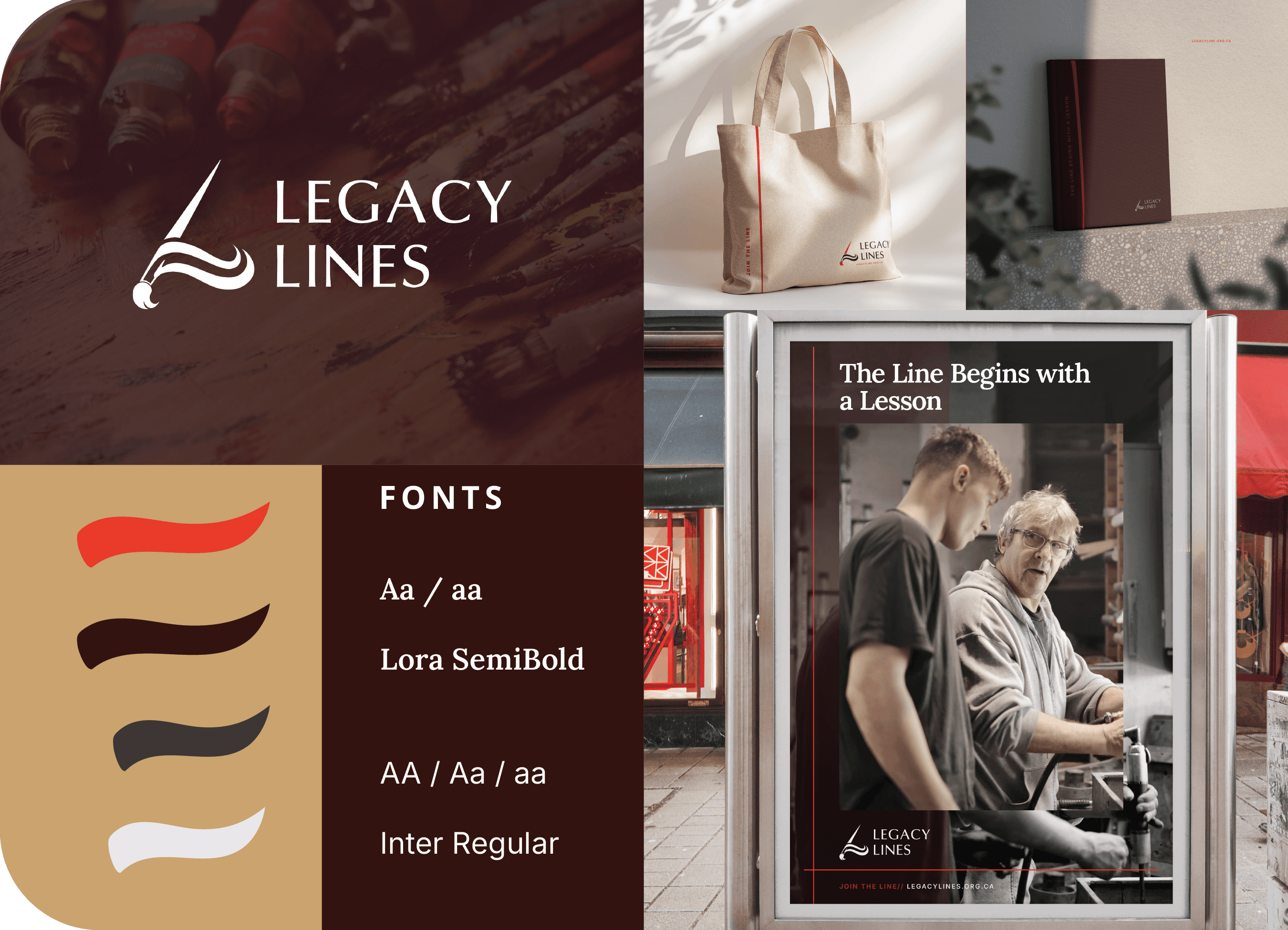
The core visual identifier is a fluid, gestural brushstroke that represents the artisan's hand. This form was designed to be malleable; it serves as a connector between data points in the digital app while acting as a bold, expressive graphic on large-scale bus stop posters. This duality reinforces the mission of connecting historical mastery with future vision.
TYPOGRAPHY HIERARCHY
To reflect the brand's mission of bridging time, I utilised a contrasting typographic system:
The Serif (Heritage): A classical, high-contrast serif used for mission-driven copy, providing a sense of historical weight and permanence.
The Sans-Serif (Utility): A clean, modern sans-serif utilised for metadata and technical information within the digital archive and app interface, ensuring maximum accessibility and clarity.
COLOUR PALETTE
The palette is rooted in Obsidian Plum, Warm Crème, and a functional Action Red.
Obsidian & Crème: These provide a sophisticated, "museum-grade" foundation that elevates the art being showcased.
The Red Retract Bar: Used as a persistent visual anchor in the digital UI, this colour signifies "active exploration" and exploration mode, guiding the user through complex lineage maps and archives.
——————————————————————————————————————————————————
UI & UX DESIGN
WEBSITE
The Legacy Lines web experience was designed as a "Living Museum." Moving away from standard corporate layouts, I utilised a High-Contrast Editorial Grid that prioritises the "Hand of the Artisan."
The Home & Story Modules: I engineered a narrative-first landing page where the "Living Line" acts as a persistent guide, leading users through the brand’s mission. The layout uses asymmetrical white space to give the archival imagery room to breathe, reflecting a premium, museum-grade aesthetic.
Modular Programs Interface: To showcase the various mentorship streams, I developed a set of modular "Content Tiles." These tiles utilise a clean typographic hierarchy, ensuring that the metadata (dates, locations, and artist names) is legible while maintaining the visual dominance of the artwork.
APP
The mobile application serves as the functional heart of the brand, a specialised tool for mapping the transfer of artistic knowledge.
The Lineage Map: I developed a vertical, centralised layout to visualise the Mentor-Apprentice hierarchy. This "Thread" interface allows users to trace an artistic style back through centuries, making the abstract concept of "Legacy" tangible and searchable.
Minimalist Data Entry: To ensure the app remains accessible to all generations, the search and entry interfaces were stripped of unnecessary clutter. I implemented a single, clean input field that encourages discovery without overwhelming the user with complex filters.
Persistent Navigation (The Red Retract Bar): I engineered a high-visibility "Action Red" retract bar that remains in a persistent state during active exploration. This serves as a functional anchor, allowing users to instantly jump between different map layers or archival records without losing their place in the lineage.
year
2025
timeframe
6 Weeks
tools
Adobe Illustrator, Photoshop, Figma
category
Branding & Identity
01

02

03

04

05

06

07

08

09