APEX
APEX Arena is a comprehensive brand identity and UI/UX project engineered for the high-performance sports industry.The final deliverable includes a full-scale e-commerce digital experience, emphasising technical precision and a minimalist, industrial-modern aesthetic.
00

problem
The sports industry is saturated with high-energy but often cluttered visual identities. The challenge for APEX Arena was to build a powerful, narrative-driven brand that could compete in this aggressive landscape while maintaining a sophisticated, minimalist edge. I needed to translate abstract psychological drivers, overcoming limits, sustained energy, and the "multidisciplinary shift", into a coherent visual system that feels premium enough for the city but rugged enough for the gym.
solution
I engineered a scalable identity centered on high-contrast geometry and a precision-led typographic system. By utilizing a "Navy and Action-Orange" palette, the mark achieves instant recognition and an aggressive, forward-leaning stance. This system was then expanded into a comprehensive digital ecosystem and physical touchpoints, ranging from responsive e-commerce interfaces to technical apparel and large-scale venue environmental graphics, ensuring brand consistency across every athlete's touchpoint.
BRAND IDENTITY
LOGO
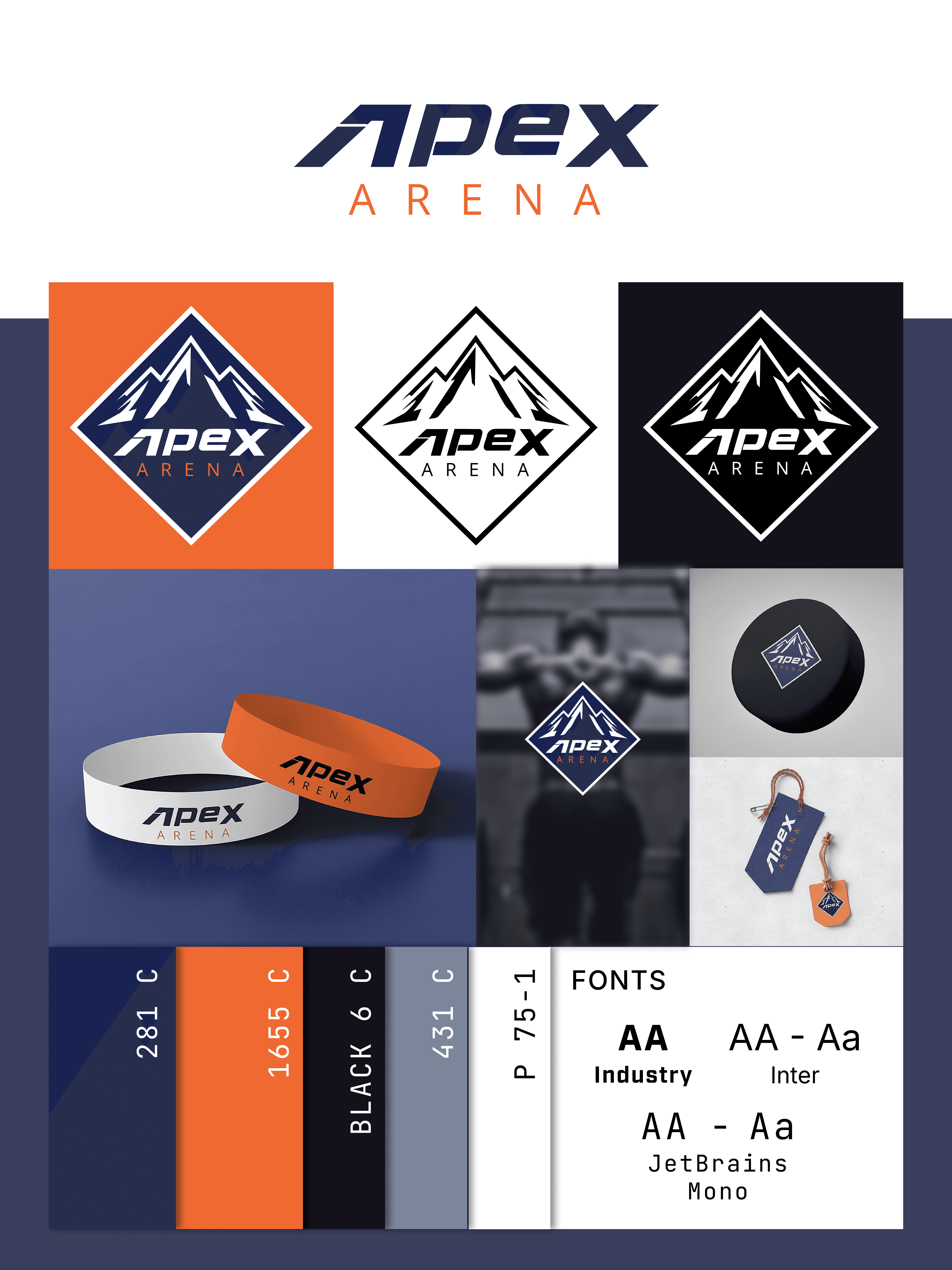
The APEX icon is built on a foundation of equilateral geometry, symbolising peak performance and stability. The triangular framework represents the "Mountain" (the challenge) and the "Arrow" (the forward momentum). By utilising a balanced, symmetrical construction, the mark remains legible at micro-scales, such as app icons, while maintaining a commanding presence on large-scale stadium environmental graphics.
TYPOGRAPHY
The typography was selected to bridge the gap between industrial utility and modern sophistication. I utilised a high-contrast, sans-serif typeface with wide apertures to ensure maximum readability under high-stress visual conditions (stadium screens, moving apparel). The kerning is intentionally tight to create a "solid" visual block, mirroring the density and strength of the athletes who wear the brand.
COLOUR PALETTE
The colour system is rooted in Obsidian Navy (281 C) and Action Orange.
The Navy: Provides a premium, grounded foundation that distinguishes APEX from the traditional "Neon" sports market.
The Orange: Injected as a "Kinetic Highlight," it serves as a functional trigger, drawing the eye to critical UI elements and safety touchpoints on performance gear.
ADAPTIVE GRID SYSTEM
Beyond the logo, the brand identity uses a mathematical grid system inspired by architectural blueprints. This allows for a modular application across digital interfaces and garment construction, ensuring that whether a brand element is on a 23 x 30 poster or a 32 px button, the proportions remain identical.
——————————————————————————————————————————————————
RETAIL ECOSYSTEM
UI STRETEGY - DIGITAL EXPERIENCE
The APEX e-commerce interface was designed to mirror the brand’s core philosophy: Invisible Technicality. I engineered a "clean-room" digital aesthetic, utilising a high-contrast, minimalist grid that allows the product photography and technical illustrations to act as the primary visual drivers. The UX is optimised for high-velocity navigation, ensuring a frictionless path from discovery to checkout.
MERCHANDISING
Unlike standard retail sites, the APEX shop utilises an Editorial Layout. I integrated custom technical illustrations and lifestyle "lookbooks" directly into the product grid. This positions the brand as a multidisciplinary curator, bridging the gap between elite sports performance and high-end urban streetwear.
PRODUCT ARCHITECTURE
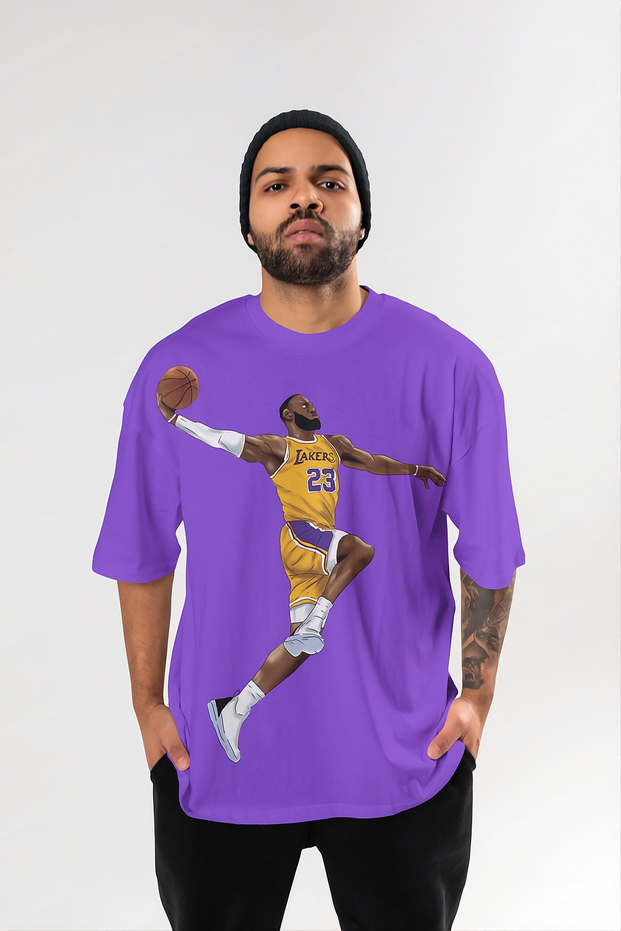
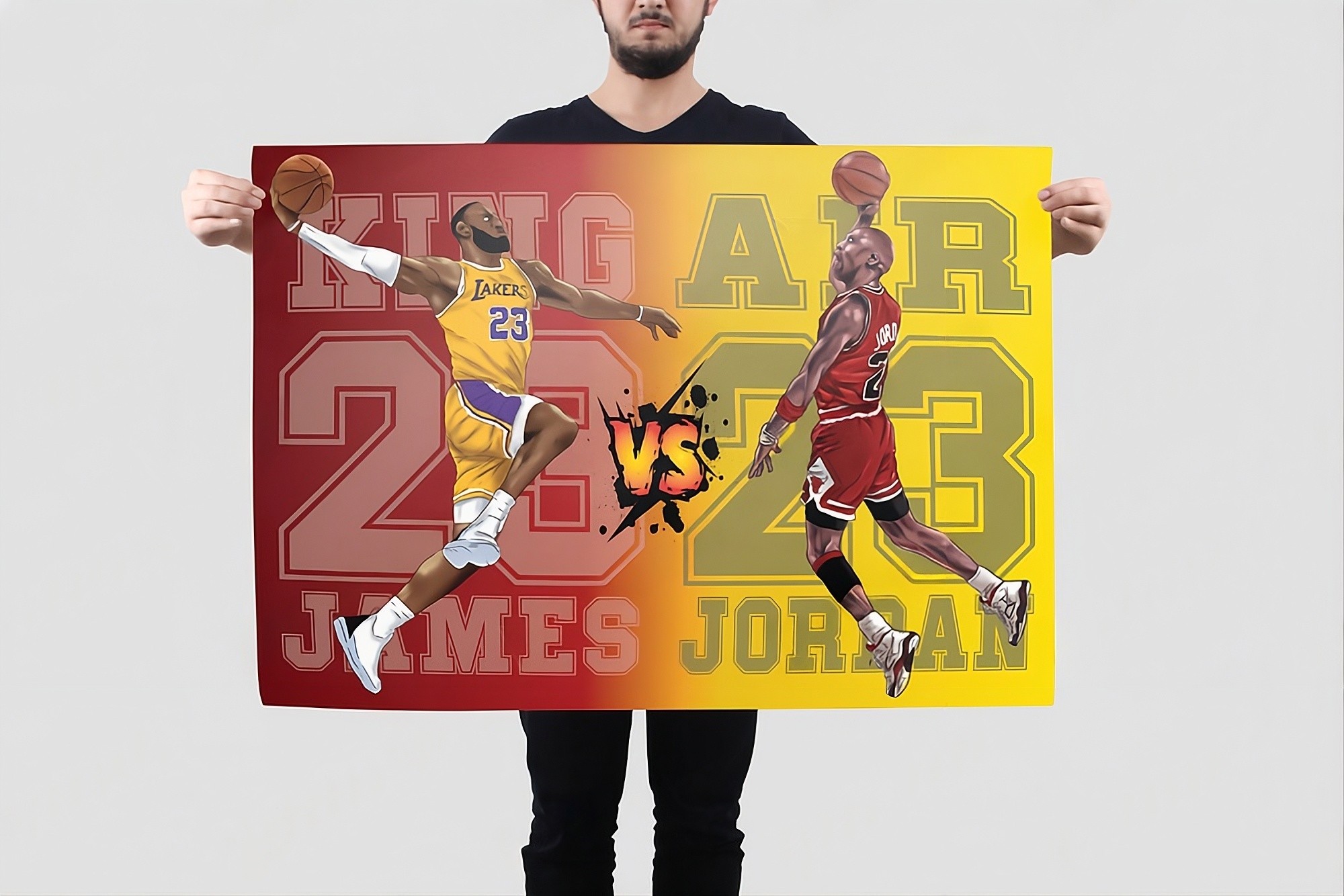
A key feature of this design is the seamless integration of Proprietary Illustration. I showcased how the "Apex DNA" can be translated into various product categories, ranging from technical hoodies and performance headwear to limited-edition "drop" graphics. By placing these alongside global sports heritage brands, I demonstrated the visual authority and market-readiness of the APEX aesthetic.
BRAND CONTINUITY
The website architecture serves as a stress test for the brand's scalability. From the Dynamic Hero Slider to the Modular Category Tiles, every element adheres to the mathematical grid system established in the logo construction. This ensures that the premium "Arena" feel remains consistent across all screen sizes and retail touchpoints.
LINK: apex-arena.framer.website

year
2025
timeframe
30 days
tools
Adobe Illustrator, Photoshop, Figma, Framer
category
Branding & Identity
01

02
03
04

05

06

07